Bitcoin Rainbow Chart (BRC) is a very important indicator that proves the limits of Bitcoin price. The best known and most reliable methods are trading. However, there is one tool that is gaining more importance because of its efficiency: the Bitcoin Rainbow Chart. Industrial engineer and crypto expert Victor shares more about this tool.
What is the Bitcoin Rainbow Chart?
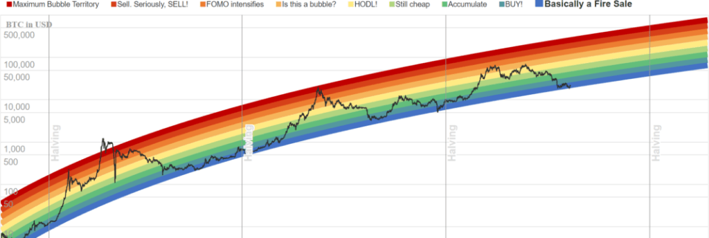
The Bitcoin Rainbow Chart (BRC) is a long-term investment vehicle introduced in 2014. There are 7 colors that follow a logarithmic regression. So we’ll explain them from top to bottom:
- 1.Red: (Max Bubble Zone.) This is the peak time you need to sell.
- 2.Red: (Sat. Seriously. SELL!) If the price of Bitcoin hits this level, don’t wait until the next. Bitcoin price is usually very short here.
- 1.Orange: (FOMO Intensifies) Since this level, the idea is to be very careful if the price of Bitcoin continues to rise. Because it is possible to fall at any moment.
- 2.Orange: (Is this a bubble) There is always a part of you that you believe is not organic in the increase in Bitcoin price.
- Yellow: (HODL) This is the middle of the road and you should just consider waiting. Because you know that the Bitcoin price will likely continue to grow.
 Source: Blockchain Center
- 1. Green: (Still Cheap) This is your last chance to buy cheap BTC. This is what happened on September 7 when the BTC price hit $18,000.
- 2. Green: (Saving) Once you find BTC at this level, you only need fresh money to buy as many BTC as possible. As you will see in the image below, time is telling this tool is right.
- Sky Blue: (Buy) Clearer? Buy, buy. If the Bitcoin price continues to meet this indicator, your BTC retirement account will thank you.
- Blue: (Basically Fire Discount) BTC prices are rarely this low. We’ve seen this more often in this recent bear market.
How accurate is the Bitcoin Rainbow Chart?
So far, the Bitcoin rainbow chart has been met in almost 100% of BTC history. The only time BTC price went outside the bounds of this indicator was in late 2013. On the other hand, you can see that every time BTC halving occurs in late 2012, mid 2016 and 2020, the BTC price always makes the biggest increase. The next BTC halvin will be in March 2024. So, if you have a website, you can embed this indicator with this code.
People will make fun of it but for Bitcoin, this Rainbow Chart has been deadly accurate for a decade. pic.twitter.com/DW5PsJC4jT
— Jay Dilks (@DilksJay) September 7, 2022
BRC – Stock-to-flow price model comparison
cryptocoin.com You know PlanB’s stock-to-flow price model from . Anonymous Twitter user PlanB created the model, claiming to be a Dutch institutional investor with a legal and quantitative finance background who manages nearly $100 billion in assets.
The model involves calculating a ratio based on the quantity in circulation against the current supply of an asset. The higher the number, the longer it will take for production to meet current demand and the scarcer a good will be.
To everyone who is still convinced that the Stock-to-Flow model is valid, please hear me out. I won’t go into technical autocorrelation/cointegration stuff here. Just some honest results that @100trillionUSD is withholding. https://t.co/pjWhb7Ggk9
👇🧵
— Tim Stolte (@TimStolte98) September 13, 2022
So, these 2 Bitcoin price prediction models are the most famous. If you analyze them, you can see that BRC is more accurate considering Bitcoin’s price history. There is only one exception to this indicator in 2013. However, as you can see in the tweet below, there are many exceptions to the stock-to-stream model.
Finally, it’s true that these two indicators trying to predict BTC price over the long term are pretty good references. Traders appreciate this. But in the end, we should not stick to a single method of investing strategies or traders. Never stop exploring new ways.

